Responsive Web Design vs Separate Mobile Site – Which is right for you?
Responsive Web Design
It’s been obvious for a while now that mobile internet use is on the rise. In fact some estimates suggest that as early as 2013, more people will use mobile devices to access the internet than desktop computers.
It’s equally obvious that if you’re building a website now, you need to think about accommodating mobile users.
Until recently (or to be more precise, until this article by Ethan Marcotte in May 2010), accommodating mobile users meant creating a separate mobile version of your content. While this is fine, it comes with a few disadvantages (which I’ll get to soon).
Over the last year and a half, however, another option has emerged.
Responsive Web Design.
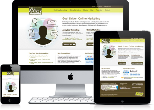
Responsive web design is a relatively new web development technique in which the layout of a website changes according to the size of the screen it is being viewed on. This means that the one website can be optimised for mobiles, tablets and full-sized monitors (and whatever else might be coming in the near future).
On top of that, responsive websites are pretty cool. Check out these examples by following the links then slowly resizing your browser window and watching the elements shuffle around.
- Robot or Not – Ethan Marcotte’s original example
- The Boston Globe – An amazing feat of responsive web design
- 10K Apart – From the very smart people at An Event Apart
- AR Web Design – My own website
So which is the better option?
Well actually, both options have their advantages. A better question is “Which option is right for me?”
There are three things you need to consider when deciding: context, content and of course your current situation.
Context for Responsive Web Design
If your website is responsive, it will serve the same content to both small and large screens, the only thing that changes is the formatting. If you have a separate mobile website however, you can (if you like) serve completely different content to a mobile user.
To decide whether or not to show different content to mobile users, we need to consider their context.
For example, consider if you were to access our website from your computer at home. It’s likely that your goal is to see how we stack up against other web companies, so you’ll probably check out some of our free tools, view our portfolio and maybe read about our methodology.
Mobile
If you’re accessing our website from a mobile however, it’s likely you have different goals in mind. Maybe you’re on your way to our office and need to double check our address or call to tell us you’re running late.
So in our case it might make sense to serve different content (specifically, contact information) to mobile users. It might be different for your website though, have a think about what you can assume (if anything) about a user accessing your website via their mobile, and whether that means you should serve different content to mobile vs desktop users.
Be aware though that mobile users aren’t always “mobile”. More and more people are using their mobiles to access the internet from home while watching TV. There are still plenty of people who’s sole internet connected device is their phone. And as phones get better, it will become more and more difficult to predict a mobile user’s intentions.
Content
A big consideration when developing a website for mobile devices is speed. Mobile users are often using slower or weaker internet signals than desktops, and mobile browsers are still a bit slower than their desktop counterparts. This means it’s important that we don’t include anything unnecessary, especially if it’s likely to impact on the load time.
One of the disadvantages of responsive web design is that while you can easily tell design elements not to display on mobile devices. In most cases it doesn’t stop them from being downloaded and taking up bandwidth. To some extent you can get around this by serving mobile content by default, then only downloading desktop assets for larger displays, but the more images, slideshows, videos and general interactivity your site has, the harder it’s going to be to stop it from downloading on mobiles. In this case, you might be better off choosing to have a separate mobile site developed.
Your Current Situation
The last thing to consider when making your decision is your current situation. I.e. How satisfied are you with your current website? How’s your budget? How valuable are your mobile visitors (potentially)?
If you already have a website and want it to become responsive, chances are it’s going to need to be completely re-designed, so will likely be more expensive than developing a separate mobile version. Of course if you’re not happy with your current website, this may be a good thing.
If however you don’t already have a website (or you’re not happy with your existing website), taking the responsive approach may be cheaper than going with a separate mobile version, as a new website and separate mobile version would usually be thought of as separate projects.
Of course, while one option may be cheaper than the other, it doesn’t always mean that’s the path you should take. If your mobile visitors are potentially valuable, or if you get (or hope/expect to get) a lot of mobile traffic, you should probably spend more time considering context and content than budget.
In Short
Responsive web design is really cool, but has it’s disadvantages in some situations. If your mobile users want different content to your web users, or if your website is full of functionality and interactivity, you may be better off developing a separate mobile website. Otherwise, go responsive…
MARKETING METHODOLOGY
PS. When you're ready, here are 6 ways we help consultants & advisors grow:
1. Web Strategy Planning Template (PDF). Our flagship 1-page tool we co-created with David Meerman Scott. It’s been downloaded over 1 million times and featured on Forbes.
2. Read a free chapter from our book. Web Marketing That Works --- an Amazon #1 best seller.
3. Join the private group on Facebook. Access free training resources, and hang out with 2,300+ peers.
4. Discover your marketing score. Take the 40 point Marketing Scorecard (in < 6mins) and get a customised report.
5. DIY with the 50+ Script Library. It's for connecting with new people and nurturing them into high-value clients.
6. Let's brainstorm how to fill your marketing funnel. DM the word "INTERESTED" via Messenger or book a 20 min slot to talk on Zoom.
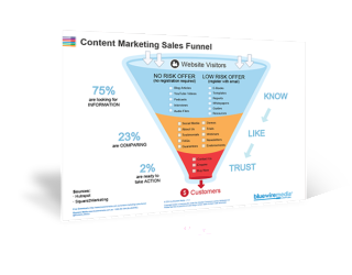
Content Marketing Sales Funnel
Your content marketing sales funnel is all about getting people to know, like and trust you by nurturing them with the right information at the right time.
- Guide To Email Marketing Strategies 2022! Learn. Practice. Execute […] subscribers like and are willing to give
- 7 Effective Email Marketing Strategies Can Convert Traffic To Leads - richieblogs […] subscribers like and are willing to give
- 5 Tipps für erfolgreiches E-Mail-Marketing - Robin Weinmann […] gratis bekommen. Diese Tatsache sollten
- Lifecycle Marketing vs. Traditional Sales Funnel - MarketingProfs.com - Gossip Buz […] map how customers will remain in your ma
- Fake negative comments – Bluewire Media – wolfgangherfurtner […] Source link […]