7 Common Mistakes to Avoid on Your Mobile Site
This is a guest post – Mitali Purkait Ghosh is the Co-Founder of High Position. Here she talks about the importance of mobile websites and the mistakes to avoid while developing mobile friendly websites.
Welcome Mitali…

You can’t keep pushing it down your to-do list.
How visitors experience your mobile site should be your number one priority.
With over 50% of all traffic on the internet coming from mobile devices, and this figure increasing every day… Your business won’t survive without a mobile responsive website.
Before writing this post we did some research into a group of mobile sites that had made some fundamental errors when it comes to user experience.
From this research we found seven common problems – let’s take a look at how you can avoid making the same mistakes and make your site mobile friendly.
1. Unplayable Content
“This video is not available on mobile”
Is there anything more annoying for a mobile user that this?
If you are still stuck in the days of Flash Players or videos restricted by license, it’s time you came out of your time warp.
Having this problem can have a detrimental effect on your mobile site experience and chase away potential customers.

The Solution = HTML5
It’s time to bid goodbye to Flash and make use of HTML5 Animation and Video tags.
HTML5 works universally on all mobile browsers and offers a seamless experience to users. You may also embed videos from sites such as YouTube onto your mobile site and improve the multimedia experience for users.
2. Slow Loading Speed
If desktop users give a mere 8-10 seconds for your website to load, mobile users are more impatient.
A recent survey shows that over 40% of users abandon a website after 3 seconds and a second delay increases dissatisfaction levels by 15%.
Site speed is also one of the most important factors affecting your search engine rankings.
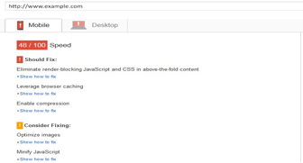
The Solution = Know Where You Are Going Wrong
You need to know where you are going wrong before you can fix it.
Tools such as Google Page Speed Insights let you pinpoint the problem and take corrective actions.
For example, one tip to speed up your page loading time is to compress all JavaScript or CSS files on your site.
3. No Social Sharing Option
Imagine a website that has no social sharing option? It looks so outdated.
Ten years ago, mobile sites were poorer cousins of their desktop counterparts. With low bandwidth and small screen sizes, users didn’t complain and were happy to read only the text content. But this is not the story today.
The Solution = Let Them Share
Your mobile site should always allow the users to share what they browse on social media. In fact, most social activity happens on handheld devices – not traditional desktops or laptops.
By including relevant social sharing options on your mobile site you can attract new eyeballs and improve brand recognition.
4. Irrelevant Cross Linking
It is common practice to show a mobile optimised page to a user on a separate URL.
For example a web page www.yoursite.com may be shown as m.yoursite.com.
The problem arises when the developer forgets to create a mobile optimised version for all web pages. This means some desktop pages are redirected to irrelevant mobile pages or vice versa.

The Solution = All Web Pages Must Have Mobile Pages
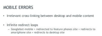
You need to religiously ensure that all your web pages have corresponding mobile pages. Make it a habit of publishing the mobile pages simultaneously along with the desktop version of the page.
5. Blocked CSS, JavaScript, and Image Files
Do the search engines matter to you?
If yes, you should avoid blocking CSS, JavaScript or image files. When you block access to these files from search engine crawlers, it prevents them from appropriately indexing your site.
The Solution = Check robot.txt
Make sure that your robot.txt file allows access to GoogleBot. You can verify this access status by using the ‘Fetch as Google’ feature in the Google Search Console. You can also put the site under the Mobile Friendly Test to verify it’s mobile friendliness.
6. Long Forms
Filling up long forms is undesirable for most users – even on desktops.
Typing on a small screen remains an issue and if your forms are too long it gives users an easy option to close the window and browse another site.
The Solution = Keep It Short
Simplify forms on your site and make sure you don’t ask any irrelevant questions from visitors.
If you use the same form for desktop and mobile users, ensure that most of the fields are optional.
7. Mobile-only 404s
Mobile-only 404s are error pages that only occur on mobile devices. This makes users think that the mobile site is broken and they quickly exit.

The Solution = Use Webmaster Tools
The Google Search Console offers you insights into any mobile specific page that leads to 404 errors. Take note of the crawl error reports shown by Google webmaster tools.
Once a 404 is detected, redirect users to the proper pages to ensure they enjoy a seamless experience.
Don’t ignore mobile users.
If you’re not confident with web development – hire someone who can create the best desktop and mobile experience for your users. It’s your recipe to sustainable online success.
 About Mitali
 About Mitali
Mitali Purkait Ghosh is the Co-Founder of High Position. Here she talks about the importance of mobile websites and the mistakes to avoid while developing mobile friendly websites.
Bonus 3 3 Free Templates

Download the 33 free templates from Toby and Adam’s book.
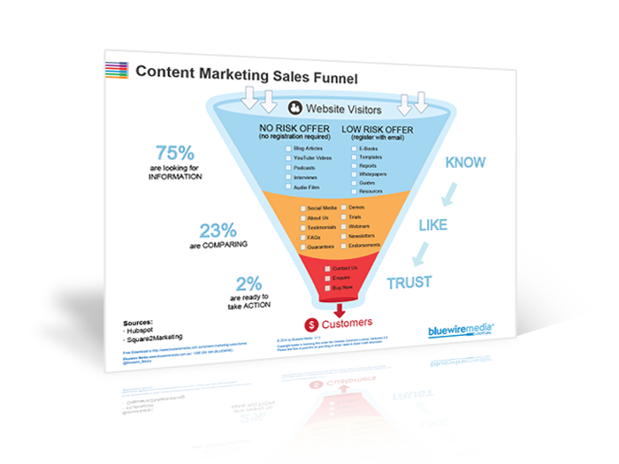
Content Marketing Sales Funnel
Your content marketing sales funnel is all about getting people to know, like and trust you by nurturing them with the right information at the right time.
- Guide To Email Marketing Strategies 2022! Learn. Practice. Execute […] subscribers like and are willing to give
- 7 Effective Email Marketing Strategies Can Convert Traffic To Leads - richieblogs […] subscribers like and are willing to give
- 5 Tipps für erfolgreiches E-Mail-Marketing - Robin Weinmann […] gratis bekommen. Diese Tatsache sollten
- Lifecycle Marketing vs. Traditional Sales Funnel - MarketingProfs.com - Gossip Buz […] map how customers will remain in your ma
- Fake negative comments – Bluewire Media – wolfgangherfurtner […] Source link […]