The Psychology of Colour in Web Design
This is a guest post — James Berrios is a Graphic Designer, Internet ninja. Bacon practitioner. Analyst. Tv nerd. Amateur coffee maven. Food lover. Thinker. Avid entrepreneur. Imagination Creator. Connect with James on Twitter and read his personal blog here.
Welcome James…
The world is filled with colours.
They are present in every part of our lives. They influence feelings, emotions, actions and behaviors. Often individuals attribute meaning, moods and feelings to colours.
Each of us has our own ‘personal colour palette’ that influences the way we perceive things, therefore, unconsciously associate emotions. Colour sense is generated from the age of infancy through personal taste, life experiences and the cultural framework we live in. This influences our decision, taste and even purchasing behavior over the years.
When we talk about web design, ‘choice of colours’ is perhaps the most important decision of all.
What colours should you use to engage your audience?
Where to start
When considering the colours you will use in your web design, ask yourself these questions:
- What is the purpose of your website?
- Who is our target audience and what message do we want to convey to them?
Through the emotions evoked by colours you can direct the will of web surfers and subtly influence them into a purchase decision.
Each colour influences us in a different way, and understanding these nuances could be the difference between great web design and a massive bounce rate.
In saying that, I’d like to share with you some examples of websites that have rightly used the tint, saturation, value, contrast and tone of colour palettes in their web design.
Use of Basic Colours in Web Design
Red
Red is a colour with a vibrant and exciting spectrum, expressing many positive elements of life.
This colour easily gets our attention and provokes our emotional reactions.
Red is the colour of audacity and determination, which stimulates a sense of urgency and immediacy. This is also used for negative associations that include war, violence, fire and anger.
Usually the target audience for this colour is young people because it conveys strength and passion to them. For web design, darker tones of red are more preferable as they leave lasting impressions.
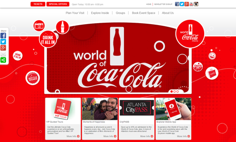
The example above is of Coca Cola’s website: the design uses red with a light grey and white background. This gives a pleasing look and visible contrast. The use of this colour promotes the brand’s credibility and draws your attention to the product offered. This color is good for fashion, entertainment, food, marketing, advertising, sports and emergency services.
Yellow
Yellow is the most ‘cheerful’ of the colour wheel.
It is bold and original: great for creative websites to attract attention and give a special look to your layouts.
If you need to design a website for youth activity (a local event, or an e-commerce website), experiment with yellow and orange, these colours give vivid spectrum to your design.
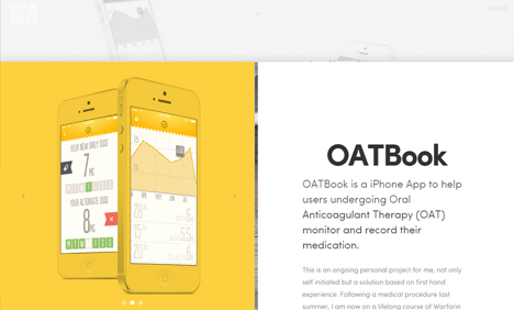
The combination of white, yellow and grey in the Warface’s website is super modern and sophisticated as well as energizing.
Blue
The colour blue is relaxing and positive, it expresses a feeling of well-being, tranquility and peace. Blue is mostly used by large corporations and technical businesses.
Because it inspires confidence and gives an encouraging feel, blue is a colour widely used in sites of a political nature.
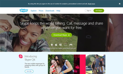
In the examples below we see the beautiful blue in the White House website. Also, the combination of blue with white on the Skype site – invoking friendliness, trust and confidence.

Green
Green is the colour of nature, it conveys peacefulness, well-being and optimism.
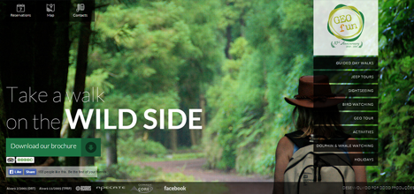
The use of this colour is great for science, tourism, human resources, environment, sustainability and medicine. The use of green in the example below of the Geo Fun website evokes a connection with nature, with the sense of simplicity and purification.
Other Colours
Brown
Brown is a warm colour, it represents comforting heat and is often associated to the land and nature.
In lighter shades, tending to beige, it expresses a feeling of comfort, and is particularly suitable to give the website a professional visual. It’s an elegant colour, especially if combined with a tint like gold.
In the example below of Huston bread; it shows a layout of different shades of brown. This type of colour selection is usually used to stimulate appetite (chocolate and coffee etc.).

Purple
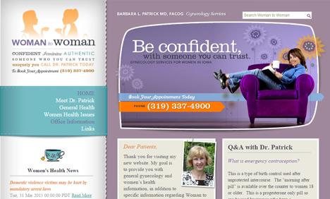
Purple reflects royalty, luxury and nobility in design. This colour is commonly used for beauty products, astrology, yoga, massage spas and content that is related to adolescent girls and feminine brands like Woman to Woman.
Pink
Pink is the colour of women, it is a tint of red that reflects delicacy and romance. This colour is used for feminine products or sites with content for young girls.
For example, the Barbie website.

Neutral Colors
Black, White and Grey
These colours are usually used in the background of a website and allow brighter colors to make an impact.
Black represents ‘power, modernity and sophistication’ and belongs to the aggressive spectrum (mysterious and impenetrable). Use of neutral colours such as black, give the opportunity to enhance the images of the web layout.
White comes with purity, innocence and chastity. Mostly this color is used to give a minimal style and is essential to a layout of the website.

Another neutral color is grey, which expresses detachment and solemnity.
It is elegant like white and black, but definitely more neutral. This color is perfect to show seriousness and composure in a non-aggressive manner. Grey also draws the shades of silver and steel, which express modernity and design; for this it becomes easy to find various shades of the color in the graphic compositions that present products and software solutions.

Fluorescent Colours
It may be interesting to combine neutral colours (black, white or grey) with fluorescent colours in the graphical composition of web design.
The contrast with any color so bright can be very eye-catching.
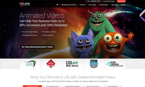
The design solution provider company Logo Jeez makes use of fluorescent colours (particularly red) with neutral colours (black and white). The fluorescent shades in this website show the creative originality and liveliness of the company.
Pastel Tones
Pastel colours contain a very high percentage of white (about 70%) and appear soft and delicate. Use of pastel tones gives a very inviting feel to a website.
Johnson’s Baby is an example.
You will most likely find pastel colours in layouts with content related to early childhood that conveys delicacy and tenderness.
Conclusion
Most common colours communicate with our unconscious feelings and send us different ‘messages’. In web design, we can use this to our advantage.
Once you understand how colours inherently provoke emotions in visitors, it becomes easier to choose the right mix for your brand and audience.
 About James
James Berrios is a Graphic Designer, Internet ninja. Bacon practitioner. Analyst. Tv nerd. Amateur coffee maven. Food lover. Thinker. Avid entrepreneur. Imagination Creator. Connect with James on Twitter and read his personal blog here.
Content Marketing Sales Funnel
Your content marketing sales funnel is all about getting people to know, like and trust you by nurturing them with the right information at the right time.


 About James