Is Your Website’s Design Discouraging Visitors from Returning?

Whether you have an ecommerce business or you’re selling online services, having an excellent looking, easily navigable website is critical if you want your visitors to return, time and time again.
While website functionality is often prioritised, don’t neglect aesthetics. According to a study by Adobe, 38% of people will stop engaging with a website if they feel the content and/or layout is unattractive.
If you ask ten people what constitutes a great business website, you’re likely to get ten different answers. However, there are some common website design pitfalls which apply to all types of businesses.
If you can avoid making these website design mistakes, your return rate will dramatically improve.
1. Slow Loading Times
It shouldn’t surprise you to hear that, in 2017, people are incredibly intolerant of slow-loading websites.
A study by Akamai indicated that 40% of online shoppers will wait no more than 3 seconds before leaving a travel or retail website. Additionally, 52% of online shoppers stated that quick page loading is essential for brand loyalty.
If people have to sit and wait for your content to appear, you’re in trouble. Consider altering your image formats and pursue other site modifications to improve your site’s loading speed. Your web host may have other suggestions, if these suggestions alone don’t do the trick.
2. Low Resolution or Generic Stock Photography
If you grabbed the bulk of your website imagery from Morguefile or Pixabay, you may have a problem. Instead of using stock photographs of people in business suits, blatantly posing, why not use photos of your actual clients or workforce?
Low-resolution images make a similarly bad impression. For eCommerce sites, amateur product photography indicates that you either don’t take your brand seriously or that you’re drop shipping items from Aliexpress (and you’ve probably just screen-shotted someone else’s images).
Even if you are drop shipping someone else’s products, it’s worth taking the time to book a new photo shoot and display professional, high-resolution images on your site.
Finally, please don’t outsource your company’s logo for $5 on Fiverr. Your logo is the most important visual asset of your business. The cost of a professional designer is worth the brand recognition benefits later on as your company grows.
3. Poor Navigation
When arriving on a company’s website via a referral site, 50% of people will orient themselves using the navigation menu. If users find a site difficult to navigate, they’re likely to give up and seek out a competitor offering similar services.
Navigation should be a seamless experience – something that functions perfectly without the user being aware of it.
Ensure your navigation is consistent from page to page (with both textual and visual elements). Divide your categories clearly and use succinct text to clearly describe what’s within each page – ambiguity will irritate your visitors.
Also, consider integrating a search feature into your site. Make sure to compensate for spelling mistakes, as well as language variations.
I also recommend testing your site’s navigation elements. For instance, you can send paid traffic via Facebook to your site, then log the results.
Send traffic from one ad to a control version of your site, then traffic from another ad to a version of your site with one of the navigation elements changed (such as a different navigation menu). Log the bounce rate, conversions and time spent on each page to see how visitors perform.
In one case study where traffic was sent to a landing page encouraging website signups, a 100% increase in conversions was achieved by removing the navigation menu completely.
You can also use Inspectlet to watch how your visitors interact with your site, then make adjustments based on the visual feedback.
4. Poor Font Selection

Contrast is another important aspect to consider. Low contrast fonts are a bad choice in general, but they can become utterly unreadable when you factor in users with visual impairments, low-quality laptop screens, and over lit corporate environments.
As a general rule of thumb, if your site has a dark background, then use a light font. Conversely, if you have a light background, then use a dark font.
Check My Colors is an excellent online resource for comparing background and foreground colour combinations.
5. Inappropriate Line Height
When you consider that 60% of marketers create one piece of new content every day, it’s important that your content is easy to read.
Even if your content is well structured, with plenty of digestible paragraphs and subtitles to improve scannability – an inappropriate line height can make your text look cluttered and unappealing.
Even if you consistently upload great content, people won’t return to your site if they dislike the visual layout.
While some companies choose to leave the line height of their web copy at 100%, setting your line height to 140% (or thereabouts) gives your text room to breathe and improves readability.
6. Broken Links
Broken links relate to navigability, but they’re worth mentioning as a standalone issue. If your visitors are browsing your site and come across too many 404 error pages (and sometimes one is too many), you’re making a terrible impression.
First, this means the visitor isn’t able to find what he or she is looking for, which is annoying.
But also, it demonstrates that your company doesn’t care enough to ensure their information is up-to-date. And if you can’t even update your broken links, how dedicated will you be as a business partner?
By entering the URL of your 404 page in the content section of Google Analytics, you can regularly check for broken links and fix them before they cause problems.
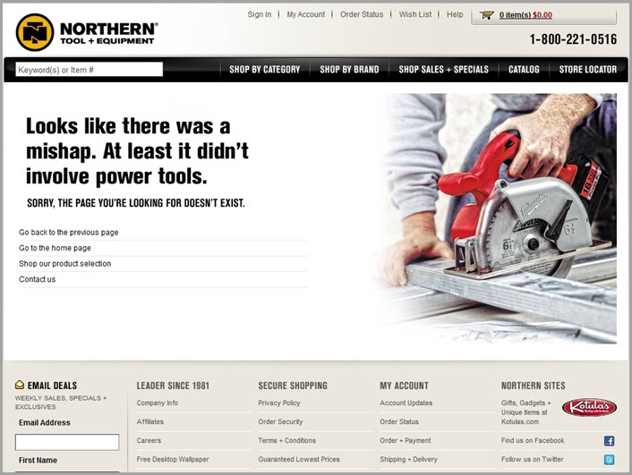
Of course, since it’s hard to stay on top of broken links all of the time, you might want to consider making an engaging or entertaining 404 page for when problems do occur. Visitors will be more forgiving of a broken link if you manage to make them laugh.

7. Stagnant Content
If you’re not able to stick to the commitment of regularly uploading blog content, then your site shouldn’t have a blog, to begin with.
If a new visitor arrives at your site and sees that your last blog post was several months (or years) ago, this indicates the site isn’t being regularly maintained, which they’ll take to mean that the business is dying.
In addition to blog content, everything else on your site should be up-to-date. Antiquated industry news or product information makes a bad impression and will discourage your visitors from returning.
Can you think of any other mistakes that will affect your website’s return rate? Please let me know in the comments below:
 About Aaron
Aaron Agius is an experienced search, content and social marketer. He has worked with some of the world’s largest and most recognised brands, including Salesforce, Coca-Cola, Target and others, to build their online presence. See more from Aaron at Louder Online, his blog, Facebook, Twitter, Google+and LinkedIn.
Bonus 3 3 Free Templates
Download the 33 free templates from Toby and Adam’s book.
Content Marketing Sales Funnel
Your content marketing sales funnel is all about getting people to know, like and trust you by nurturing them with the right information at the right time.

 About Aaron
